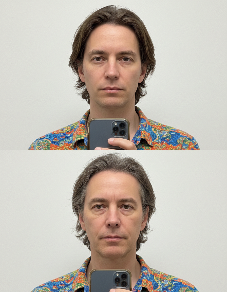
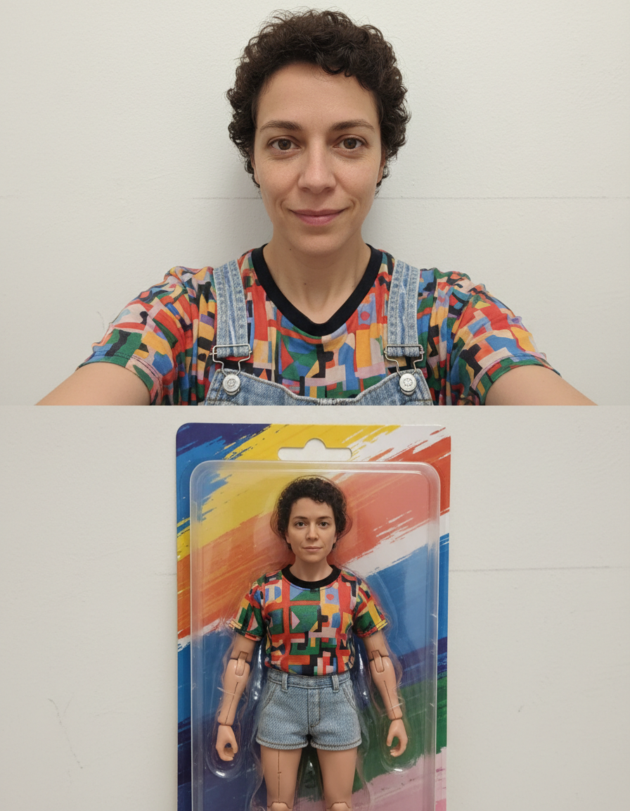
Jewelry Photo Editor
Make metal and stones read properly. Pick a style, choose a model, and download the result at full resolution with no watermark.
Pick a style on the left, then hit Apply. Your original stays untouched — you always see both.
How to use Jewelry Photo Editor
Photograph the product
On a plain surface in soft daylight, shot square-on or at a consistent angle. Even a phone photo is enough — what matters is that the product is sharp and the whole of it is in frame.
Choose the setting
White sweep, studio, lifestyle, marble, natural or gradient. White for the main listing image, the others for gallery shots and ads.
Generate and download
Full resolution with no watermark, ready to upload to a listing or drop into a layout.
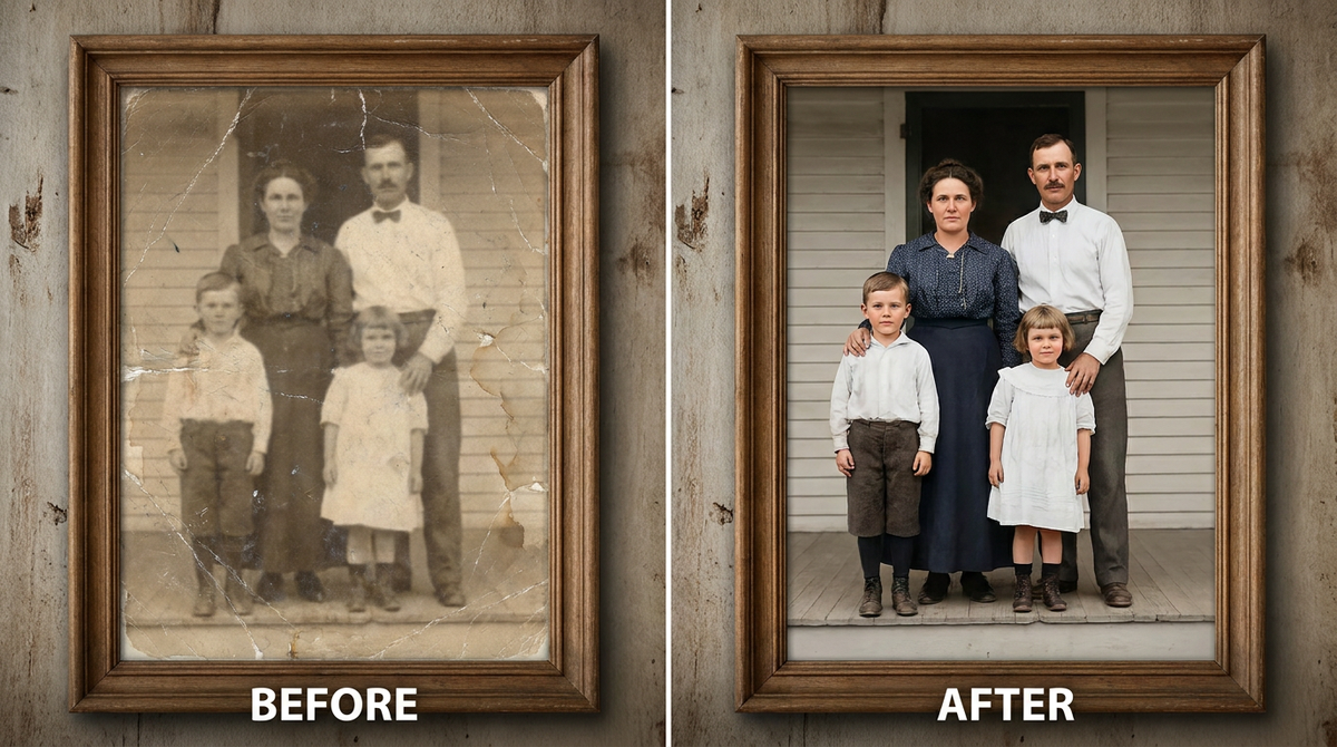
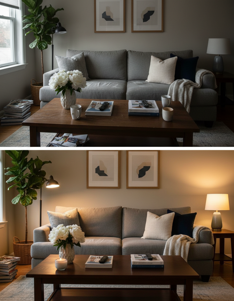
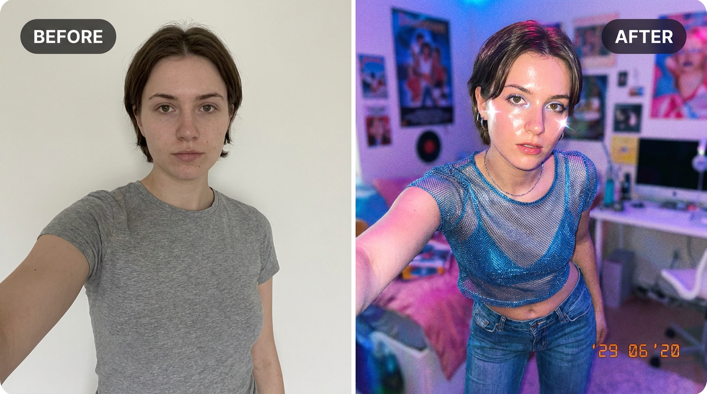
See it in action — real before & after


Why use Jewelry Photo Editor
What Jewelry Photo Editor does
Make metal and stones read properly.
Consistent across a catalogue
One background and one lighting setup applied to every product, which is what makes a listing page look professional.
Lifestyle scenes without a location
A styled surface with props defocused behind, generated rather than staged.
Any ratio a channel needs
Square for listings, 4:5 for a feed, wide for a banner, all from the same source photo.
Marketplace-compliant main images
Pure #FFFFFF, product centred with even margins, soft contact shadow — the specification Amazon, Flipkart and most marketplaces check against.
The material reads correctly
A specular highlight is what tells a viewer whether something is matte plastic, brushed metal or glazed ceramic. Getting it wrong makes a product look fake.
What Jewelry Photo Editor changes
Enhance this jewellery photograph: clean dust and fingerprints, render metal with accurate warm or cool tone and crisp specular highlights, bring out gemstone brilliance and facet definition, on a clean gradient backdrop.
Your face, bone structure and skin tone are held fixed on every generation — only what is described above is changed.
Jewelry Photo Editor for every image a listing needs
A product needs more than one photo. The main image, the gallery, the ad creative and the banner all have different requirements.
Gallery and detail shots
Studio backdrops and angles that show material, finish and scale.
Lifestyle and in-use scenes
The product on a real surface in a real room, which is what converts once the listing has been opened.
Ad and social creative
Backgrounds with deliberate empty space for a headline, in each platform's ratio.
Seasonal variants
The same product restyled for a campaign without a reshoot.
Key highlights of Jewelry Photo Editor
Benefits
Nothing to install
It runs in the browser on a phone or a laptop. No desktop app, no plugin, no account needed to look around.
Two models to choose from
Nano Banana and GPT Image handle the same job differently. If one result is not right, the other model often is.
Every aspect ratio
Square, 4:5, 9:16, 16:9 and more, chosen before generating so nothing important gets cropped away afterwards.
Full resolution, no watermark
The download is the full generated image with nothing overlaid — usable in print, in a listing or commercially.
The free tools stay free
Compress, convert, crop, resize, rotate and the rest run on your device, unlimited, with no account and no credit cost.
What people use it for
What it is mainly used for
Make metal and stones read properly. Pick a style, choose a model, and download the result at full resolution with no watermark.
Clothing and accessories
Fabric texture and drape rendered so the material reads as what it is.
Food and drink
Lighting that makes food look appetising rather than clinical, which is a genuinely different setup.
Wholesale and trade sheets
Print-resolution product images for a catalogue or a line sheet.
Amazon and marketplace listings
The white main image, generated to specification rather than argued with after a rejection.
Prompt ideas
Describe the surface, the light and the shadow. Product prompts fail by being aspirational — "premium look" means nothing, while "white marble, soft light from the upper left, soft contact shadow" means exactly one thing.
Name the material
"Matte plastic", "brushed aluminium", "glossy ceramic". This is what governs the highlight, and the highlight is what sells the material.
Keep labels readable
"Keep the label text and logo exactly as they are" protects the part of the packaging that carries the brand.
Handle props explicitly
"One or two props, well out of focus behind" for lifestyle shots; "no props at all" for the main image.
Leave room for a headline
"Empty space in the upper third" when the image is going into an ad.
Be concrete, not complimentary
"Soft light from the left, plain grey background" gives the model something to act on. "Beautiful, high quality, 8k" gives it nothing at all.
Change one thing at a time
If a result is close, edit a single detail and run it again. Rewriting the whole prompt gives you an unrelated image and no information about what the change did.
More about Jewelry Photo Editor
Commercial product photography is unglamorous and rule-bound. The main image usually has to be on pure white with the product filling most of the frame. The material has to read correctly, which means a specular highlight that describes whether something is matte, brushed or glossy. There has to be a contact shadow, or the product floats. Colour has to be accurate, because colour is what returns get argued about. Those constraints are the tool's actual brief.
Upload the product shot, pick the background and lighting, and download. Each generation costs 2 credits from a one-time pack, so producing a white version, a studio version and a lifestyle version of one product is a few cents' worth of credits rather than a second shoot.
Marketplace photography is a compliance exercise before it is a creative one. The main image has to be on pure white, the product has to fill most of the frame, and a rejection costs days. Jewelry Photo Editor is built to those rules rather than to a general idea of a nice photo.
Getting the best result from Jewelry Photo Editor
- Shoot every product in a range from the same angle so the catalogue stays consistent.
- Say "pure white #FFFFFF" for any marketplace main image.
- Always request the contact shadow.
- Name the material so the highlight is right; this is what separates a real-looking product shot from a render.
- Check colour against the physical product before publishing — colour accuracy is what returns are about.
- Verify that label and logo text is unchanged and still legible.
- Generate the same product on two or three backgrounds and test which converts.
- Use the largest original you have; print collateral needs the resolution.
It's free to try and runs online — nothing to install. Explore the rest of our AI Creative Apps, or open the full AI photo editor for more control.