Photo to Oil Painting
Visible brushwork and canvas texture. Pick a style, choose a model, and download the result at full resolution with no watermark.
Pick a style on the left, then hit Apply. Your original stays untouched — you always see both.
How to use Photo to Oil Painting
Upload the photo
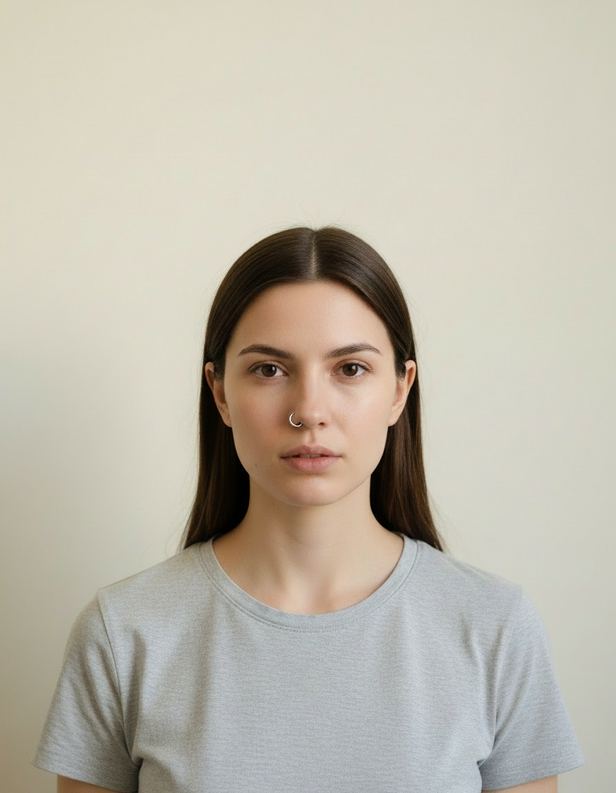
A clear JPG, PNG or WEBP. Portraits work best when the face fills a reasonable part of the frame — a distant full-body shot gives the model very little face to work from.
Pick the style or write your own
Choose a preset, or describe the medium you want: line weight, palette, texture, era. Naming the medium precisely is what separates a good result from a vague one.
Generate and download
Full resolution, no watermark. Good enough to print, use as an avatar, or send to someone as a gift.
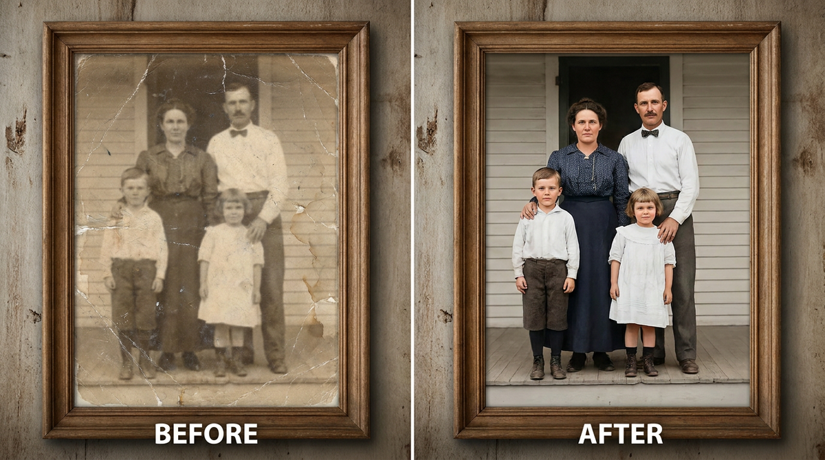
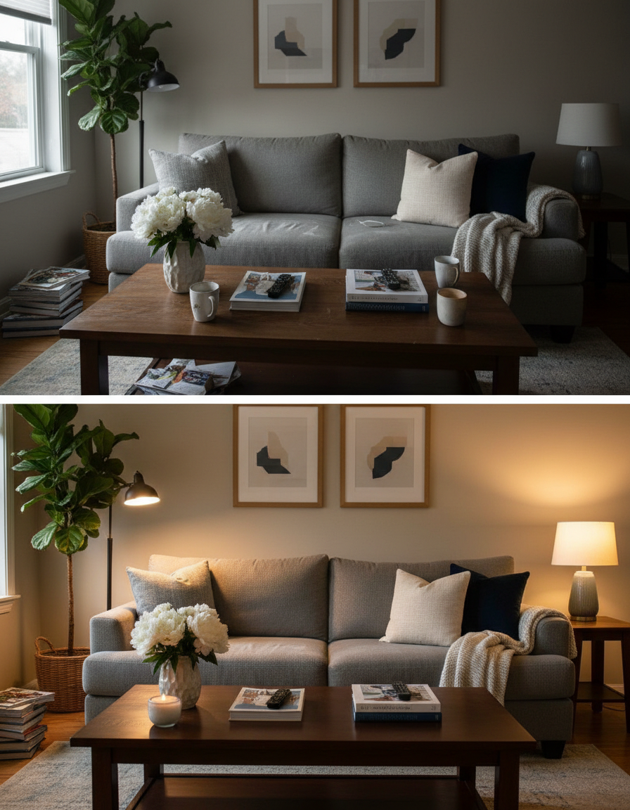
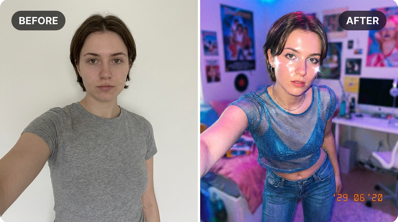
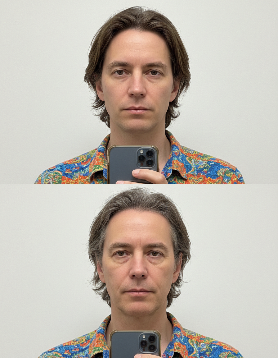
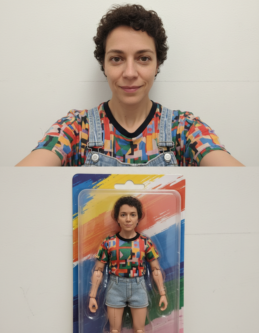
See it in action — real before & after


Why use Photo to Oil Painting
What Photo to Oil Painting does
Visible brushwork and canvas texture.
No drawing skill needed
No tablet, no brushes, no layers. The skill required is choosing a good source photo.
Any ratio you need
Square for an avatar, portrait for a print, wide for a banner or a cover. Set before generating.
Cheaper than a commission by orders of magnitude
An illustrated portrait typically runs from $40 to several hundred. A pack of credits starts at $2.
Recognisable after the conversion
Facial proportions and the details that identify a person are carried into the new medium rather than replaced by a generic character face.
A real change of medium
Brush texture, ink weight, cel shading, moulded plastic, woven canvas. The material of the image changes, not just its colours.
What Photo to Oil Painting changes
Repaint this as an oil painting: visible directional brush strokes, built-up impasto in the highlights, a classical warm palette, and canvas tooth showing through the thinner passages.
Your face, bone structure and skin tone are held fixed on every generation — only what is described above is changed.
Photo to Oil Painting for prints, avatars and gifts
The same conversion serves very different ends — a profile picture, a framed print, a card, a set of matching avatars for a group.
Prints and framed gifts
A converted portrait of a person, a couple or a pet is the kind of gift people keep, and it costs the price of the frame.
Cards and invitations
An illustrated portrait sits on a card in a way a photograph usually does not, without needing a designer.
Matching sets for a group
A team, a family or a friend group converted in one style, which looks deliberate in a way individual photos never do.
Covers and thumbnails
A stylised image survives text overlaid on it far better than a photograph does — the flat areas give the type somewhere to sit.
Key highlights of Photo to Oil Painting
Benefits
Try several styles for the price of one commission
Compare mediums on the same photo instead of committing to the first description that sounded good.
Nothing to learn
No illustration software, no tablet, no understanding of layers or masks.
Keeps the likeness
The point of a portrait is that it is of someone. Identity preservation is applied to every person-editing prompt.
Full resolution and no watermark
Print it, frame it, use it commercially. Nothing is stamped on the result.
No subscription
Credits are a one-time purchase and never expire. Nothing renews.
What people use it for
What it is mainly used for
Visible brushwork and canvas texture. Pick a style, choose a model, and download the result at full resolution with no watermark.
Book, album and playlist covers
A stylised portrait as cover art, with room for a title to sit over it.
Party and event invitations
The host, illustrated, on the invitation. Faster than finding clip art that is not terrible.
Social content and trends
Style trends move in days. Generating the look while it is current beats commissioning it for after it has passed.
An avatar that is not another selfie
Stylised portraits read as a deliberate choice in a grid of photographs, and they stay legible at tiny sizes.
Prompt ideas
Presets cover the common styles. If you write your own, describe the medium as a maker would: line, colour, texture, era. Vague adjectives like "beautiful" or "high quality" do nothing; "thick ink outlines, flat colour, halftone shading" does a great deal.
Constrain the palette
"Muted earth tones, four colours only" produces a coherent image. Left open, most models reach for saturated everything.
Give an era or school
"1970s screen print", "Renaissance oil", "90s anime cel". Era carries a whole set of conventions in two words.
Say what happens to the background
"Flat single-colour background" for an avatar, "stylised landscape behind" for a print.
Keep the likeness explicitly
Adding "keep the face recognisable" helps on the more abstract styles where the medium starts to dominate.
Set the framing
"Bust, shoulders up" for an avatar, "full figure" for a poster. This decides how much of the style you actually see.
Ask for clean space if text is going on it
"Leave the upper third uncluttered" gives a title somewhere to go, which is the usual reason a good cover fails.
More about Photo to Oil Painting
The difficult part is not applying a filter — it is keeping the person recognisable while genuinely changing the medium. A good stylised portrait still reads as you: the proportions of the face, the set of the eyes, the hairline. A bad one is a generic character with your colour palette. This tool is tuned for the first outcome, which is why a clear source photo matters more than the style you pick.
Each generation costs 2 credits from a one-time pack. That is cheap enough to try the same photo in three styles and keep whichever one your friends actually recognise you in.
Every few months a visual style goes around, and the people who get the most out of it are the ones who post while it is still moving. A commission takes a week. Photo to Oil Painting takes a minute, which is the difference between joining a trend and documenting it afterwards.
Getting the best result from Photo to Oil Painting
- Check hands, glasses and any lettering — these are where stylised results most often break down.
- If you want a matching set, keep the style and the prompt identical and change only the source photo.
- For printing, generate at the largest ratio you can and crop afterwards rather than upscaling later.
- Keep the original photo. A generated image is a poor starting point for a different style.
- Start from the largest, least compressed original you have — a screenshot of a photo has already lost detail that cannot be recovered.
- Soft, even light in the source photo gives the best result almost regardless of what you are generating.
- Judge every result at full size, not zoomed out. Problems hide at small sizes.
- Generate two or three times before deciding. Results vary between runs, and the first is not reliably the best.
It's free to try and runs online — nothing to install. Explore the rest of our AI Creative Apps, or open the full AI photo editor for more control.